


Try out this colored pencil color theory lesson in your art classroom, with home school students or distance learning!

Colored Pencil Color Theory Lesson
This video walks you through the steps I used with my mixed group of 10-12th graders. Feel free to use it, or keep reading if you don’t prefer a video format.

My Art II students embarked on their color theory exploration using minimal materials and an abstract composition inspired by artist Jasper Johns. I always loved Johns because he was raised in South Carolina, just like me, and I am drawn to his bold imagery and playful color schemes. He is also one of those artists that will not disappoint during a class discussion. Love him or hate him, students always find thoughtful things to say when looking at his artwork.

Practicing Colored Theory and Blending
We start out using colored pencils to explore blending and color theory focusing on color temperature (that’s a mouth full!) I created this PDF inspired by a similar version another art teacher shared way before my teaching career started in 2009. I have created several versions of this to streamline the skills I want students to focus on the most, which sometimes I like to switch up!
Classroom or Canvas Ready Tutorial:


We blend the spectrum together and then move more independently on the complementary colors and color temperature combinations. I’ve learned that students have to be taught how to blend color and create value with the pencils. Their natural inclination seems to be shading really lightly and being timid with their color blending.
I demonstrate how to blend the sphere, usually on the second day, and then students can move at their own pace with each of the color temperature examples. Yellow seems to be a struggle for many due to the lighter pigment. The orange and green can overtake the yellow easily, so this is a great color scheme for practicing layering colors with value.
Materials
Here are some of my favorite classroom materials. These work with a variety of budgets and the classroom sets are great. This post contains affiliate links to products I truly love and use in my classroom. If you use these links to buy something I may earn a commission at no additional cost to you. Thank you for supporting this public school teacher’s side hustle so I can continue to provide free content.


If you are looking for the shortened version, try the handout above. This is what I used in my YouTube tutorial and is the condensed version of the technique.
Try out this variation where I use multiple shapes including a sphere.
Composition
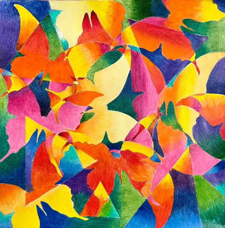
Once students have practiced blending, we move on to composition. I had students trace stencils I found in my supply closet, but there are so many directions to go with subject matter! Students can create their own stencils or play around with organic and geometric abstract shapes.
We used regular drawing paper, but students could used toned paper of any shape or size. I do recommend not going too large, to create dynamic color blending this artwork takes TIME! Even our small paper took forever. I think next time I will cut the paper into slightly smaller squares.
Make Your Own Stencils!
Another fun option is to have students pick out and create their own stencils. Students were to directed to think of a shape that interests them, but make sure that it has a simple but recognizable outline. Google: “____ silhouette clip art” and play around with keyword variations like: “simple” “outline” “black and white”. Students attached their images to a Google Document and shared with with me so I could print them. We used light boxes to transfer them to sturdy card stock and then cut them out with Xacto knives or scissors. Carbon or transfer paper also works really well.
This option allowed students to have more personal voice and made for some really fun artworks! The finished artworks will be at the end of the post.
Once students had used a variety of large, medium and small shapes, overlapped and extended shapes to the edge, it was time to apply all that color scheme practice!

Choosing a Color Scheme
I focused on color temperature, so they had to decide if their positive or negative space would be warm or cool. It doesn’t matter where they start, I often recommend to pick a color combination they feel most comfortable with.
I demonstrate blending colors using my handy Elmo document camera, which has been a game changer for my demos. Sure, all standing around a table as I demonstrate has its own fun, but this is so much more efficient! I review color temperature using our practice work and remind students to blend, layer using value and how to see color temperature within a set of colors.


Color Temperature and Blending Tutorial
This video tutorial is really helpful for absent students and for reviewing. This would be a great distance learning assignment because all you really need is the most basic pack of colored pencils and a piece of paper. Sure, your work can be elevated with the nicest brand of colored pencils and beautiful toned paper, but most of my world is #publicschoollife.
Color temperature is relative, and we focus on the basics here. I am married to an oil painter and have listened to and engaged in many debates about color. He likes to describe color as keys on a piano that you can tune depending on which note you are playing and what it’s relationship is to the notes around it.
My goal for my students with this unit is to feel comfortable seeing color and being more thoughtful about color schemes. I also think this a great way to teach blending and value, which can translate to any other artwork they may create throughout their artistic journey.
Updated Student Examples
The artworks below were created using Prismacolor Scholar colored pencils on black or blue Canson Mi Tientes paper.


Here are some of the older examples when students used premade stencils instead of making their own.


Handmade Stencil Pieces


I am so happy with the color theory connections students made during this unit. The takeaway I’m most happy with is mixing complementary colors instead of using black. It makes me so happy when I hear them reference this during our painting unit!
This artwork can be made more personal depending on the subject matter selected and has many opportunities to explore artists of your own preference.


