

Acrylic paint is so versatile and fun to work with, but can be intimidating for students. I love this abstract architecture painting because it simplifies painting concepts and allows for students to be free with their creative choices. I give no limit on color or texture application and the “let what happens, happen” attitude is freeing for (most!) students.
Do you have a short attention span like me? This video will give you a quick snapshot of each step.
This video will walk you through my steps and is classroom and Canvas ready!

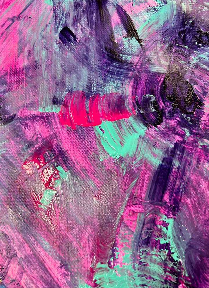
We start with a large piece of inexpensive watercolor paper, but you could use a canvas or any thick paper #publicschoolbudget. I tell students to pick three colors. These colors should work together as a group and can also connect to the country or part of the world they are inspired by. I don’t let them use black or white because we will be using these colors in their architecture designs. You can do this on a canvas, canvas board, cardboard- acrylic paint is really versatile!

This free PDF will break down this abstract architecture painting lesson into steps.
One fun design challenge is to let students use anything but a paint brush. They can use scraps of cardboard, paper towels, stamping tools- even their hands! Utility brushes and foam craft brushes work really well too. Basically anything that isn’t a tiny detail brush.


As backgrounds dry, students begin researching architecture and buildings from places that inspire them. Many choose places they wish to visit or their hometowns. Some have travel experience, but many do not. I encourage a personal connection, even if it is as simple as a place they’d love to go.
We search the name of the city or country and the words “vector sketch”. For example, I searched “Venice vector sketch” and tons of images popped up. You can also search “Venice buildings clipart black and white” although it is wordier. Most popular cities have plenty of options. I had one student that was inspired by a very small town in Texas where her Grandfather grew up. She had to be a bit more creative with her searches, but she got the idea across with some generic old fashioned Western style buildings.
I have students use this document to sketch out their ideas. It is so much easier to see their ideas and edit them on white paper. Thumbnail sketches are great for generating ideas and nailing down compositions. I remind students that this is an abstract artwork where the drawings are like a collage of buildings and design elements. We are NOT focusing on accurate perspective or architectural angles. Some students want to do just a straight line of buildings, and I have to encourage them to overlap, stack and mix up sizes in a more abstract way.
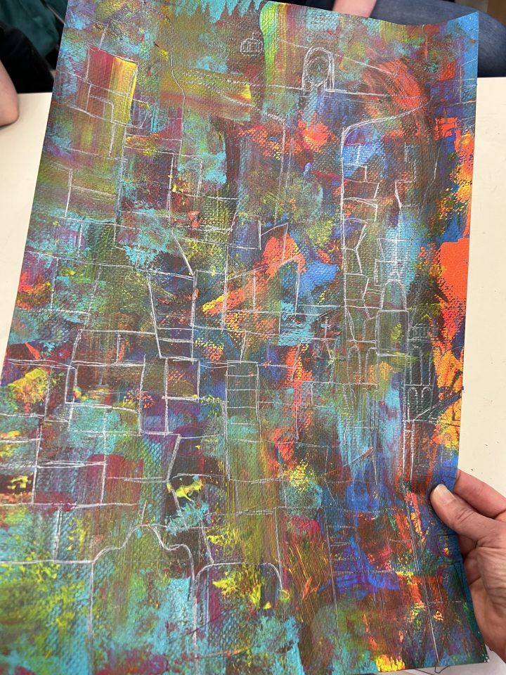
Using these sketches as a road map, we then sketch with pencil on top of our dry backgrounds.

Some students really struggle with this concept, but most love that there are no perspective rules. Especially since we just finished our India Ink Landscape artwork that was all about depth and rules of perspective!
It is challenging, but not impossible, to see pencil lines over acrylic paint. I remind them to hold their paper up to the light and change the angle. All of the “thinking” is happening at this stage. Once everything is sketched out, it is way more relaxing to just paint over the lines.
After students sketch, we start by outlining with black acrylic. We discuss and practice line variety and students outline each line they drew in pencil. I recommend black, but students have used white, silver, gray, bright red etc. This is their dominant color, so I encourage them to think of a significant color for their city or that will be dominant over their busy backgrounds.


This takes a couple class periods, and then we move on to high lights and accents. I am a huge fan of metallic silver for highlights. It ties into every color scheme and isn’t quite as dominant as white. Any metallic, white or lighter color paint is great for creating pops of highlights. This helps certain areas of buildings stand out. Students can focus on line or shape, depending on their goals. Filling in areas creates great emphasis because it blocks out some of the background.
After they add a lighter highlight color, they can add any amount of accent colors they want. I recommend picking one color that contrasts the background and then one color that compliments or contrasts it.


The finished abstract architecture paintings are always a delightful mix of architecture and texture!


